ECFR’s website had last been redesigned six years before, in 2014. That design was a leap forward as it better reflected our brand and it brought the sites of all our national offices under one roof. However, six years is quite some time for a website’s design, and more importantly: it hadn’t ever been tested with real users.
Over six months we conducted user research, engaged with our team and worked to deliver an improved design that addressed the shortcomings, both known and still unknown at that point.
Research, finally
To finally collect the feedback from our community, we conducted a survey with mostly open questions that we promoted on our web, newsletter, and social profiles. Knowing that surveys take time and many users won’t complete them, we also conducted a one-question poll on our website asking “If you could change ONE thing on this page, what would that be? And why?” to our visitors. We got a total of 112 valid responses, from 38 different countries on all 5 continents.
I analysed user behaviour with stats provided by Google Analytics and recordings and heatmaps created with Hotjar. One upside of Hotjar is that it allows us to cross-check our users’ comments with the recordings of what they were actually looking at and doing.
Finally, I gathered internal feedback from all ECFR programmes and national offices in a series of one-on-one calls: ten teams in seven different countries. Improving our colleagues’ autonomy and ownership of the tool was another goal for the whole website revamp project, which also included a CMS migration.
Here are some of the findings.
A better homepage
Most visitors reach us directly via Google, but 15% of page views are still generated from our homepage. Some users validated our hypothesis that our homepage was overwhelming, with excessive content and use of images, and lack of hierarchy.
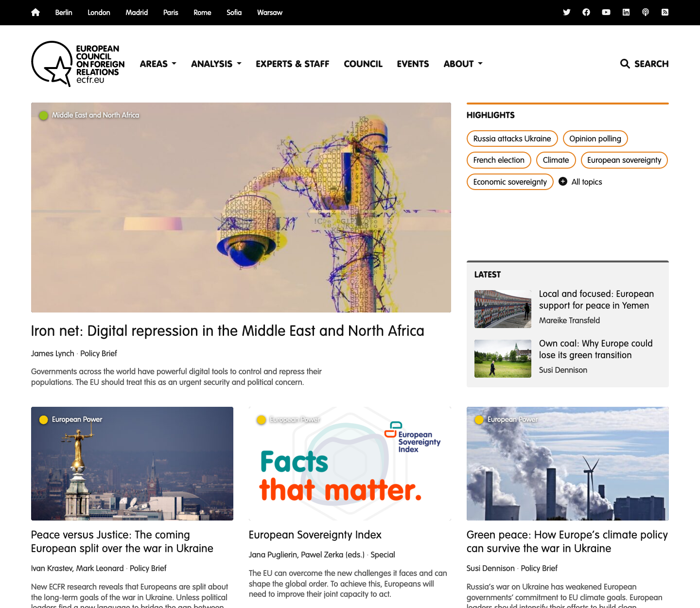
We addressed this by better structuring the content, clearly labelling featured and most recent entries, adding widgets for our areas of expertise, and leveraging white space. As a result, we ended up with a lighter page that also loaded faster, thanks to fewer and lighter images.

The website’s homepage at some point after the redesign
Working on the information architecture
Our users had mixed feelings about our website’s navigation. Whereas some of them praised it, some felt there were “plenty of sections” or found our archives hard to find. We had three different menus at the time at the very top of every page. This led us to rethink our information architecture.
During the migration, I made a content inventory, including a taxonomy tree. (This all brought back nice memories from this previous project 😊). The inventory helped streamline our formats and categories.
It is not a good practice to categorise content according to organisational charts and projects, instead of by topic. Few users were visiting the sections for specific projects. So we improved the highlights menu with self-explanatory labels and, while keeping some projects visible on the homepage, we started better explaining what they were about.

The “Featured projects” banner provides a description and displays a related flagship publication. Before that, we used to just show links with the project’s title, no context whatsoever.
Finally, we also took the chance to get rid of the “Multimedia” label. We noticed it was largely being ignored as shown by the heatmaps, and I could prove with Google Trends that the term had fallen out of fashion. People search for “podcast” 10 times more often, so we favoured that label instead.
Keep what works: print and PDF versions
It is important to fix what doesn’t work, but also not to get rid of the features that users do appreciate. Despite our expectations, many users made clear they expected to be able to download and print publications. One user with low vision mentioned that they appreciated being able to do so, as it made reading easier.
We found the accessibility argument to be particularly compelling, so we decided to keep providing PDF versions of our main publications. We also made sure to provide good styles for print.
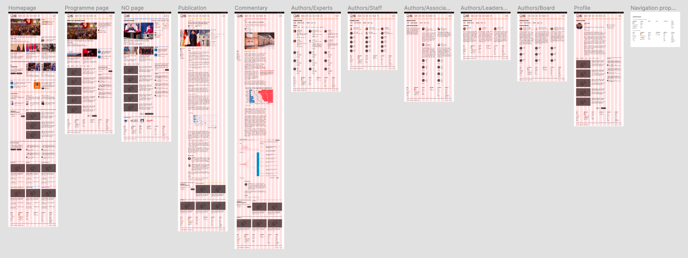
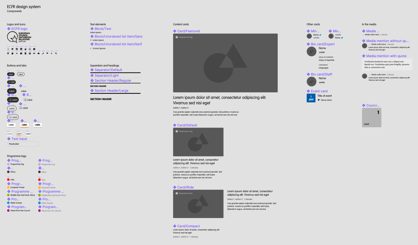
Based on these and other findings, I crafted some high-fidelity wireframes on Figma. I put them together making use of a system of components created ad-hoc. I collected further feedback from colleagues, iterated over the designs, and developed the resulting template for the website, now to be run on WordPress.

The main screens as designed on Figma

I created a series of components to reuse all across the website. We have kept using them in new sections, including specials.
Keep the feedback coming
We launched the revamped website in October 2020, after six months of work. Since then, I’ve kept monitoring the information collected by Hotjar. One year later we conducted the very same survey, with the same questions. Users praised some elements of the new design while pointing out issues that required more work. That was the case of the labelling of certain sections; we took action on that in mid-2021.