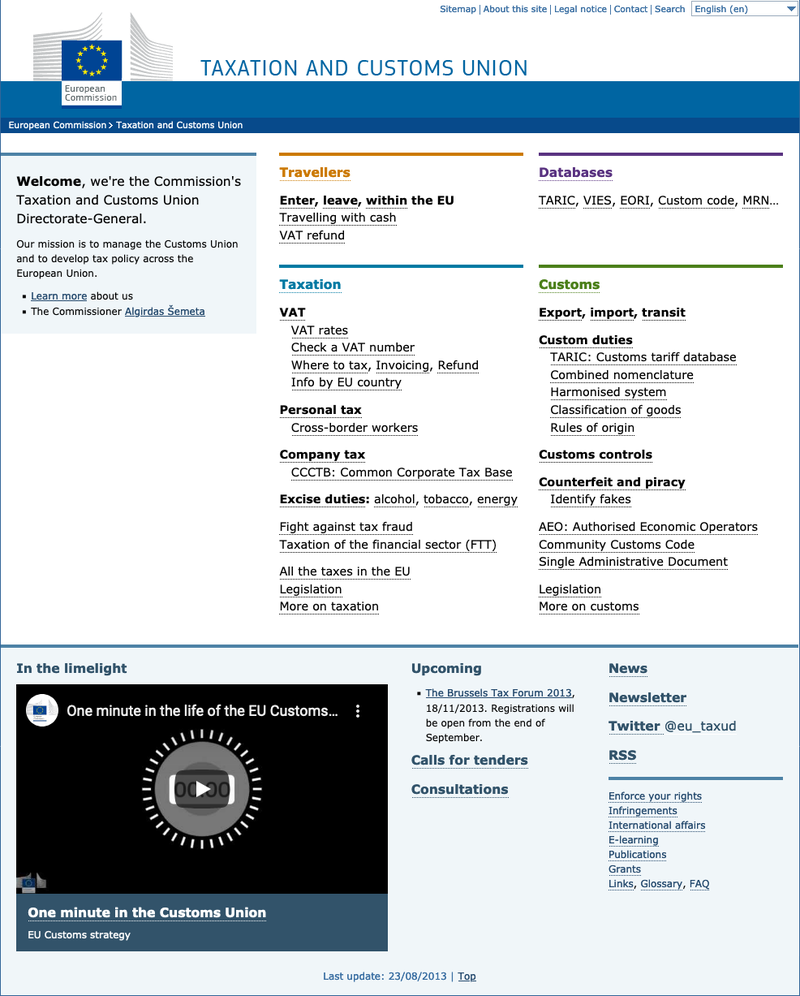
By preparing a statistics report at the request of my supervisor, I found that the most visited sections and tools on the DG website were out of sight. To access the most popular content it was necessary to click up to four times. On the other hand, the material featured on the home page received much less attention.

The website in summer 2013 (visit in Archive.org)
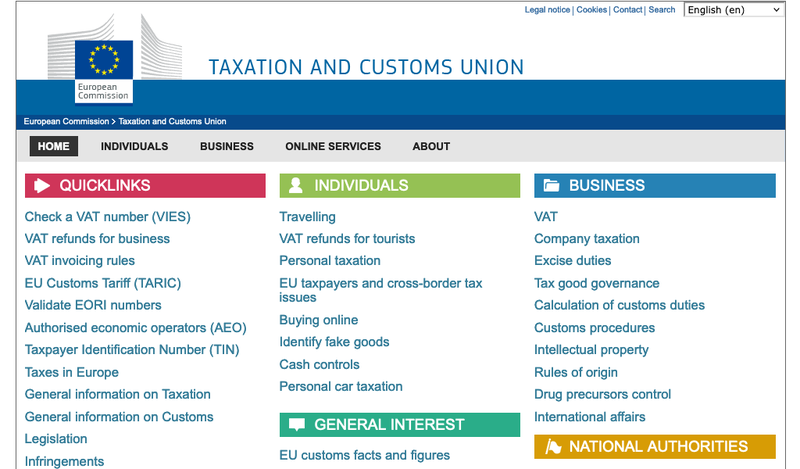
For this reason, I proposed a new design of the homepage that would bring these sections to light without the need for a site-wide redesign. Along with the wireframe, I presented some recommendations to improve the overall usability of the website.
It was a fun, meticulous, even artisanal exercise: due to restrictions in the computer that I was assigned, I had to code the wireframe (HTML + CSS) with Windows’ Notepad. To design it, I used the European Commission style guides, but I was also inspired by the great website of the British government, GOV.UK, whose practices were already being adopted by other Administrations, as was the case in the Netherlands. Links point to the screenshots on Archive.org from summer 2013.

My proposal, approved in August 2013
After I presented the proposal, it was approved by the head of the unit. In 2015, two years later, the team launched a new design, making use of some of my suggestions.

New design, implemented in 2015 (visit in Archive.org)