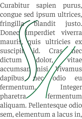
We are used to reading texts that are fully justified to left and right in books and newspapers; we even justify them ourselves in text processors such as Word. It is so tempting. For some, it gives documents a sense of perfection and professionalism. However, justifying text on a website or app is a bad idea for several reasons.
Justified text is harder to read
As my colleague Chris put it, typo rivers are no cry-me-a-river issue. Justified text is less readable because the space between words often creates so-called “rivers” of white, which can be distracting.

Example of rivers of white
Moreover, the space between words changes from line to line, disturbing the rhythm of the text. Justification also makes it difficult to keep track of the line we are reading. Even if we don’t notice, the irregular shape of left-aligned text provides a visual cue of reading progress.
Less readable means less accessible
Readability issues get even worse for readers with dyslexia. Aligning text on only one side is required to comply with the World Wide Web Consortium’s (W3C) Web Content Accessibility Guidelines (WCAG). An estimated 10% of the population is dyslexic to some extent.
Rivers and shifting spaces between words are also problematic when using screen magnifiers. Once again, it is easier to find the right line in left-aligned text, even after scrolling.
Hyphenation is not reliable on the web
OK, text is usually justified in books and newspapers. But these always rely on hyphenation at the end of line, avoiding rivers.
Hyphenation is reliable in editorial software such as InDesign, but not so much on the web. The CSS property hyphens serves this purpose, but it’s not there yet. For this feature to work, the browser needs a partition dictionary for each language. So far English is the only language with good support across all major browsers; only Firefox and to a lesser extent Safari have good support beyond English.
Rivers are less noticeable as the text body gets wider, but we also know that texts are much easier to read when there are 75 characters or less (about 12 words) per line.
On the other hand, more than 50% of today’s web traffic comes from mobile devices, where a significantly smaller line width and therefore more noticeable and annoying rivers are to be expected.
It’s bad typography
Typography is not only the shape of the characters (or glyphs) but also the spaces between characters and between words, which are carefully designed. Text justification affects the spacing between words. If you don’t have the typographical skills nor the technical ability to fine-tune word and letter spacing (and the latter is practically impossible on the web), don’t overthink it: left align all text. Let’s make the most of the work of those who design typefaces.
The most convincing argument: no major website justifies text.
Do you think that not justifying text makes it look less professional? Look closely: no major media outlet does it on its website. Neither the New York Times, nor El País, nor The Guardian, nor Le Monde. You won’t find justified text in social networks or apps either. WordPress, the CMS that runs a third of all websites, removed the justify button from its editor in 2016. Figma keeps the option to justify texts, but in a rather hidden place.
If you design for a living, you may have to convince others (clients, colleagues, or perhaps your boss) that you shouldn’t justify text. Show them how the media outlets they consider reputable don’t. Let argument from authority do what usability arguments cannot.
And in print?
Although justified text is common in print, no, it is not necessary either. The problems outlined above still apply to print. The narrower the text body, especially below 40 characters, the more problematic it gets: even when using a good partitioning system - like InDesign’s - you might still get too many broken words.
Some newspapers align some text to the left. Gemma Navarro, a designer I was lucky enough to have as a teacher some time ago, does not justify the texts in the magazines she designs. And they are beautiful. Try it, you might be surprised.
This article is largely based on this one from Design for Hackers. I’ve also used as a source The Elements of Typographic Style, by Robert Bringhurst, who, while not opposed to text justification, does argue that problems of text setting should never be “left to machines”. I don’t know if I agree (is using artificial intelligence excessive?), but it highlights the need to be careful with text wrapping.