Ensuring sufficient colour contrast is one of the minimum requirements for making a website or app accessible. For instance, any given user might have issues telling apart a light colour on top of a light background. This depends on many factors, such as screen quality or the user having colour perception deficiencies or cataracts.
The Web Content Accessibility Guidelines, the current standard in the field, offers an algorithm to check whether the combination of two colours is accessible. This algorithm is used by many design professionals to inform their colour choices. But it is not perfect.
Its excessive simplicity causes false positives and negatives. In the best case, that might result in a poorer colour palette; in the worst, in less accessible digital products. The coming version of the standard, WCAG 3, is expected to introduce a new, more sophisticated algorithm that makes up for the older one’s shortcomings.
It’s called Accessible Perceptual Contrast Algorithm (APCA).
What is different about APCA?
The current algorithm calculates contrast simply by dividing the luminance of each colour. However, as Lisa Charlotte Muth explains in this fantastic article, if the calculated luminance of a colour drops 20%, real users won’t necessarily perceive the new colour as 20% darker.
The new APCA algorithm accounts for this perceived contrast of relative luminance, which also depends on:
- Which colour is used for text and which for the background.
- This is indifferent for WCAG 2 algorithm.
- What the text size (
font-size) and weight (font-weight: light, regular, bold…) are.- WCAG 2 only accounts for this by providing two different minimum contrast rates for “normal” and “large” text (larger than 14pt/18px). The latter requires a smaller ratio given that larger text is more easily perceivable.
The forgotten colours
APCA provides a more accurate estimation of human contrast perception. As a result, it considers as valid colour combinations that we know work but that WCAG 2 rejected, and viceversa.
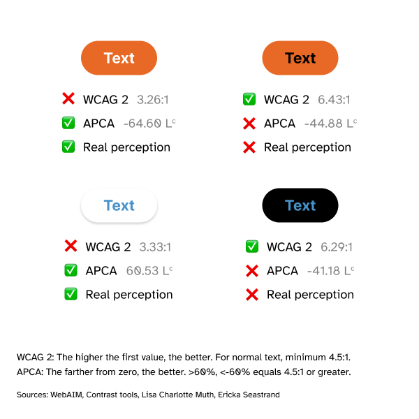
A clear example is the use of orange. When relying on the WCAG 2 algorithm, you might feel inclined to use black text on top of an orange background. But something felt wrong: when conducting user research, like Ericka O’Connor did, or even out of our own intuition, it seemed clear that white text on orange was more perceivable.
Here is a sample (not accounting for text characteristics):

Validators and tools
Even if WCAG 3 is still a draft and the algorithm is not final yet, there are already plenty of tools that let us leverage APCA:
- APCA Contrast Calculator: the “official” calculator by Myndex Research, creators of the new algorithm. You will need to enter the colours for text and background, and it will return the minimum accessible font size that you can use for any given font weight.
- Contrast tools is, in my experience, the most useful. It provides a table that shows how accessible different combinations of font size and weight are for any given pair of colours. It also explains it all pretty clearly
- If you need to assess an existing colour palette or come up with a new one from scratch, you can use tools like Accessible Palette and Color Easily. Both will let you evaluate every colour pair with APCA.
Should I start using APCA already?
Yes, you should. In the end, real accessibility is more important than the output of any tool: using colour combinations that are more perceivable is more important that meeting the standard. Testing these combinations with real users is also a good idea.
If you need to comply with the standards, then you can try to use colour combinations that are valid for both algorithms.